
Explore
Art introduces the brand
Choose
Filters, sizes and variants
Buy
Information beside the action
Confirm
Demonstration checkout
- Content model
- 46 products
- Sizes and colours
- 109 variants
- No real payments
- Front-end demo
Context and design decisions
PROJECT OVERVIEW
A fashion store needed to feel expressive without sacrificing a complete purchase flow.
Keep browsing editorial, then add clarity and instruction as commitment increases.
Live demo · 46 products · 109 variants. Payments and customer testing are not live.
KEY DESIGN DECISIONS
Remove horizontal navigation if it gets in the way of reading or shopping.
Let the artwork carry the colour and use type and spacing to organise the page.
Make the interface more explicit as someone gets closer to checkout.
- TOOLS
- Figma · HTML/CSS/JavaScript · Netlify
- WHAT I MADE
- A 46 product store: home, shop, product, bag and checkout, designed and hand built as a real, working site.
- EVIDENCE & STATUS
- Design and implementation QA across the full flow. Live and publicly browsable; the catalogue is fictional, checkout does not process real payments, and it has not been tested with real customers.
Keep the editorial character without making shopping harder
One visual language, with clearer instructions as purchase intent grows.
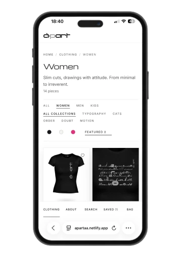
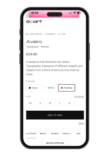
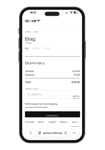
Art and shopping, balanced
The relaunch had to support filtering, comparing, choosing and checkout without losing à·p·art’s art focused character.
How might the brand feel unmistakably artistic without making the shopping experience feel experimental?
Read the thinking
Product framing to front end
Product framing, information architecture, UX/UI, art direction, responsive behaviour, accessibility, front end implementation and QA.
The store had to feel complete, not like a mockup
A believable complete fashion experience that works on desktop and mobile without flattening the brand into a template.
Stay honest about what is simulated
No live backend, inventory, payments, customer analytics or email system. The demo had to stay honest about what was simulated: a disclosure that carries through to the live site's own footer and About page.
Benchmarking, heuristics, content model
- Benchmark
- Gentle Monster, Acne Studios, COS and strong commerce patterns were reviewed for storytelling, product confidence and mobile behaviour.
- Heuristic review
- Clarity, feedback, consistency, error prevention, motion control and trust were reviewed across the full shopping flow.
- Content model
- 46 products, 109 variants, taxonomy, size, colour, fit and print information were mapped into one coherent system.
Four rules for every screen
- Art first
- Keep the brand expressive, never at the cost of task clarity.
- Visible choices
- Variants, sizes, states and consequences should never feel hidden.
- Reduce friction
- Remove effort before adding features.
- Honest demo
- Demonstrate the flow without pretending live systems exist.
From discovery to confirmation
The core loop stays simple; detail appears only when users need confidence or control.
-
01
Discover
Home
-
02
Browse
Shop · Filter · Search
-
03
Evaluate
PDP · Colour · Size
-
04
Commit
Saved · Bag
-
05
Complete
Checkout
-
06
Confirm
Demo order
Read the thinking
The main flow still includes the awkward states
Secondary paths: wishlist, size guide, empty states, 404, unavailable sizes, promo code.
Edge cases: keyboard only use, focus return, modal Escape, reduced motion, form errors.
Four interface decisions
Four decisions balance brand expression with clarity and purchase confidence.
Structure
Stable brand. Product in focus.
Discovery
Photography first. Filters nearby.
Confidence
Size, delivery and returns.
Checkout
Labels, validation and totals.
Read the four decisions
01 · Fixed brand frame
Desktop fixes the brand frame while the centre stays open for product. Mobile is rebuilt rather than scaled.
02 · Quiet product discovery
Photography carries the visual weight; filters, sort and metadata stay compact until they help a decision.
03 · Confidence before commitment
Colour, size, fit, care, delivery and returns sit close to purchase to reduce uncertainty.
04 · Checkout becomes instructional
Checkout becomes literal: visible labels, specific validation, repeated totals and a clear demo disclosure.
Trade off · Checkout is deliberately denser than the rest of the site.
Priorities across screens
Desktop preserves the brand frame; mobile rebuilds hierarchy around reading order, thumb reach and the current action.
Read the thinking
Primary destinations, one thumb away
- Mobile navigation
- Primary destinations move to the bottom and remain reachable with one thumb.
- Content priority
- Product, trust and purchase actions survive; decorative or redundant content yields space.
- Sticky actions
- Purchase controls appear only when useful and sit above navigation rather than competing with it.
Editorial restraint, implemented as a system
The interface stays deliberately neutral so the artwork carries the colour. Typography, spacing and action hierarchy do most of the work: Michroma for display type, product names and brand voice; Inter for navigation, forms and supporting copy.
- Ink #111111
- Primary text and the solid black "add to bag" action.
- Text #3A3A3A
- Body copy.
- Muted #6E6E6E
- Secondary and meta text.
- Line #E8E8E8
- Dividers and quiet structure.
- Gold #D9A51F
- An accent, not a background language, kept scarce so emphasis stays meaningful.
Action hierarchy: "Add to bag" is solid black and reserved for commitment; secondary actions like "Shop new in" stay text based so imagery remains dominant.
Validate tasks and interaction
Validation focused on task completion, interaction integrity, accessibility and implementation QA, not invented conversion claims.
-
01
Core purchase
Home / Shop / PDP / colour/size / Bag / Checkout / Confirmation
-
02
Discovery
Shop / filters/sort/search / Product
-
03
Wishlist
Saved / Bag
-
04
Mobile
Mobile navigation / PDP / Bag / Checkout
-
05
Keyboard only
Search / Modal / Product / Checkout
Three things I changed
Navigation
Horizontal, fixed-stage exploration
Vertical shopping flow
Motion
Long cinematic sequence
Shorter sequence, pause/play and reduced motion
Trust
Artificial scarcity messaging
Removed; unavailable sizes stay explicit
Changes from design and implementation review. No customer testing or conversion uplift is claimed.
Read the thinking
What implementation QA looked for
- Responsive overflow and clipped content
- Missing local assets, links and anchors
- JavaScript interaction collisions
- Focus, ARIA and selected state consistency
- Reduced motion and autoplay control
- No fake payments, emails or inventory claims
Remove the horizontal scrolling concept
An earlier version explored a horizontal scrolling, fixed stage navigation with a long cinematic motion sequence and artificial "only X left" urgency messaging. Built and tested against the brief's own usability goals, all three worked against a job application context that has to read clearly and quickly, so I removed them.
| Area | Before | After |
|---|---|---|
| Navigation | Horizontal scrolling concept | Vertical commerce foundation + editorial motion |
| Motion | Long cinematic sequence | Shorter sequence + pause/play + reduced motion |
| Trust | Artificial "only X left" urgency | Removed; only genuine unavailable size states remain |
The same components can carry different amounts of brand expression
Editorial when browsing. Explicit when deciding. Progressively more instructional as the user approaches checkout. The same type, spacing logic and restrained interaction language carry through discovery, evaluation and completion, without making every page look identical.