
Anticipate
Check the conditions
Adjust
Set preferences
Navigate
Find the route
Get support
Contact the team
- One connected visit
- Before and during
- Desk research
- Concept
- With visitors and teams
- To be tested
Context and design decisions
PROJECT OVERVIEW
Museum access information is often fragmented or missing before a visit.
Bring conditions, preferences, wayfinding and support into one continuous flow.
35 core screens. Co-design and usability testing with disabled visitors are next.
KEY DESIGN DECISIONS
Show room conditions before asking people to set preferences.
If information is missing, say so.
Keep preparation, guidance and support in the same flow.
- TOOLS
- Figma · Interactive prototyping
- WHAT I MADE
- A connected museum journey: preparation, room conditions, guidance and support.
- EVIDENCE & STATUS
- Public data research and a prototype. Collaborative design with disabled visitors is still to be done.
Access starts earlier
Plan the visit, preview room conditions and keep support within reach.
Access remains
unequal.
Read the thinking
A visit starts before the entrance
SENSORY is an independent mobile concept for checking access information, setting preferences and requesting support during museum visits. Access questions begin before arrival, but information can be fragmented, difficult to compare or missing.
The response brings preparation, guidance and support into one flow. Visitors can preview conditions, save their preferences and plan a route before they arrive. The same information and controls remain available inside the museum.
Context matters. So does its source
Public data helped frame the problem. WHO reports that one in six people worldwide lives with significant disability. The UK DCMS Community & Engagement Survey 2025/26 reports a seven percentage point gap in physical museum engagement between disabled and adults without disabilities in England.
Digital museum engagement in the same survey was 15% for disabled respondents and 16% for respondents without disabilities. Additional WHO context includes 2.2 billion people with vision impairment, 430 million needing hearing loss rehabilitation and 2.5 billion using or needing assistive products.
- 1 in 6, Significant disability worldwide · WHO, 2023
- 38%, Physical museum engagement · disabled adults
- 45%, Physical museum engagement · adults without disabilities
Museum figures: England, age 16+, UK DCMS 2025/26. These figures provide context; they are not user research. Sources were accessed in September 2026.
Public data, with its context intact
The original population, year and scope are preserved when presenting each figure. The assistive technology reference also projects more than 3.5 billion people needing assistive products by 2050.
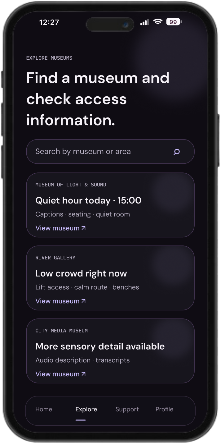
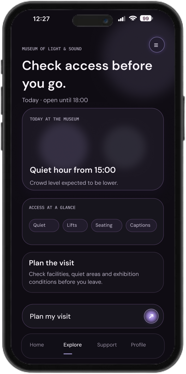
Conditions before arrival
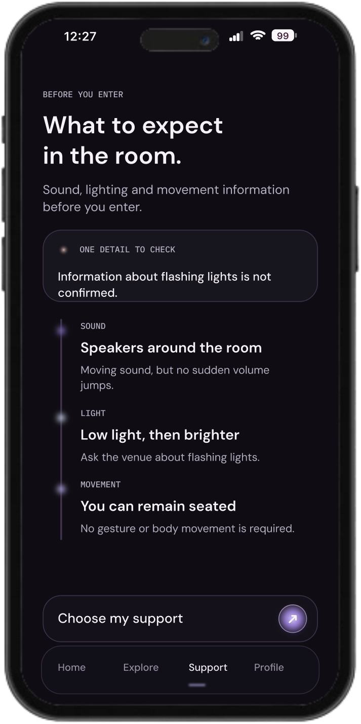
Sound, lighting and movement come before preferences. Missing information is labelled as unconfirmed.
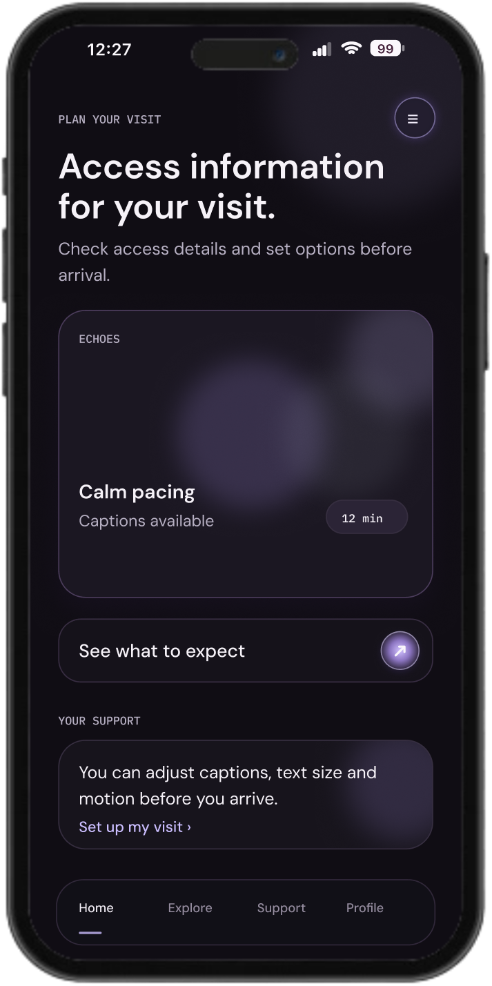
Let the visit adapt without hiding the conditions
Choose what would help during the visit. The room information stays visible; preferences change the support around it.
No preferences selected yet. Room conditions remain available before you decide.
Interactive explanation of the concept. The project still requires collaborative design and usability testing with disabled visitors.
Read the thinking
Show the conditions before asking for preferences
Visitors can judge whether a room suits them before configuring the app. Unconfirmed access information stays visible instead of being presented as reassurance.
Reassure. Guide. Protect
I used three rules to make access information easier to find and use. They connect the four moments of the experience: prepare, understand, stay oriented and ask for help.
- Reassure
- Show relevant access information before asking for preferences.
- Guide
- Keep one clear next action on each screen.
- Protect
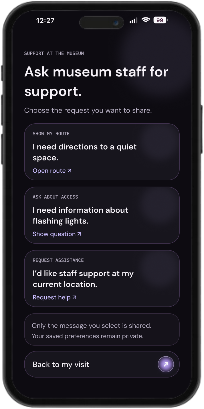
- Share only the support request the visitor selects.
Know the room before you arrive
Visitors can discover museums, preview access details and prepare a visit. Information about sound, lighting and movement supports decisions before entering a space.
When information is not confirmed, the interface says so. In the sample room, flashing light information remains unconfirmed and visitors are prompted to ask the venue. Preferences and preparation follow that context.
Support during the visit
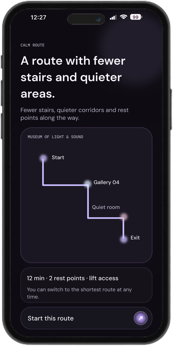
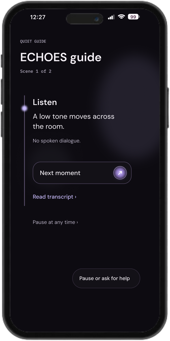
Find the route, follow a quiet guide or ask staff for support.
-
01
Prepare
Choose the visit
-
02
Understand
Preview conditions
-
03
Guide
Stay oriented
-
04
Support
Ask for help
Read the thinking
Let the visitor set the pace
Route guidance, a quiet guide, transcripts and staff support remain available throughout the visit. Visitors can stay oriented, follow content in another format and ask for help without leaving the same interface system.
The same controls follow the visitor through four moments
The interactive prototype connects 35 screens across preparation, arrival, guidance and support. The same control patterns and hierarchy repeat, so changing tasks does not require learning a new interface.
Before entering, room conditions explain sound, light and movement. Preparation leads into route guidance; guidance leads into pause and support. The system also includes preferences, saved visits, notifications, companion mode, post visit reflection and help.
- Prepare
- Search, preview and save the visit.
- Understand
- Check conditions and acknowledge missing information.
- Guide
- Keep route and content options close.
- Support
- Choose the help to request.
A calmer interface
Dark surfaces and lilac accents keep attention on content and actions.
Read the thinking
Quiet surfaces. Clear hierarchy
Dark surfaces, high contrast text and restrained lilac accents keep attention on the information. The palette combines plum black, aubergine, lilac and ice.
Primary actions repeat one button style and a small lilac focus cue. Plain language, legible contrast and predictable actions shape the interface across different tasks.
- Plum black + aubergine
- A quiet foundation and layered surfaces.
- Lilac
- A restrained accent for actions and focus.
- Ice
- Readable content and visual hierarchy.
Co-design comes next
This concept has not been tested with users. Next: collaborative design with disabled visitors and museum accessibility teams.
- Language
- Support under stress
- Real world routes
Read the thinking
The next step is collaborative design
The project focuses on practical access information: what to expect, what can be changed in the app and how to ask for help during a visit.
I have not tested this concept with users. The next step is collaborative design and usability testing with disabled visitors and museum accessibility teams.
- 01 / Language
- Does the copy reduce uncertainty?
- 02 / Support
- Are support choices easy to find under stress?
- 03 / Wayfinding
- Does the calm route match a real museum?