
Rules
Colour, type and spacing
Components
A shared language
States
Consistent feedback
Product
Desktop and mobile
- Projects, review, handoff, activity
- 4 contexts
- From action to feedback
- 6 states
- The same hierarchy
- Responsive
Context and design decisions
PROJECT OVERVIEW
Reusable UI breaks down when components, states and handoff are inconsistent.
Build one scalable system and prove it across desktop and mobile contexts.
488 items · 113 component sets · 122 showcase instances. No production deployment claimed.
KEY DESIGN DECISIONS
Keep the action in the same place across interaction states.
Reuse the same hierarchy and state language across four contexts.
Simplify the navigation on mobile without changing what matters most.
- TOOLS
- Figma · Variables · Components and variants
- WHAT I MADE
- A 488 item UI library with 113 component sets, demonstrated in WAYFIND, a product review and handoff workspace.
- EVIDENCE & STATUS
- 122 live MESH instances across 15 component families, 3 desktop and 4 mobile contexts. No production deployment is claimed.
The system in a product
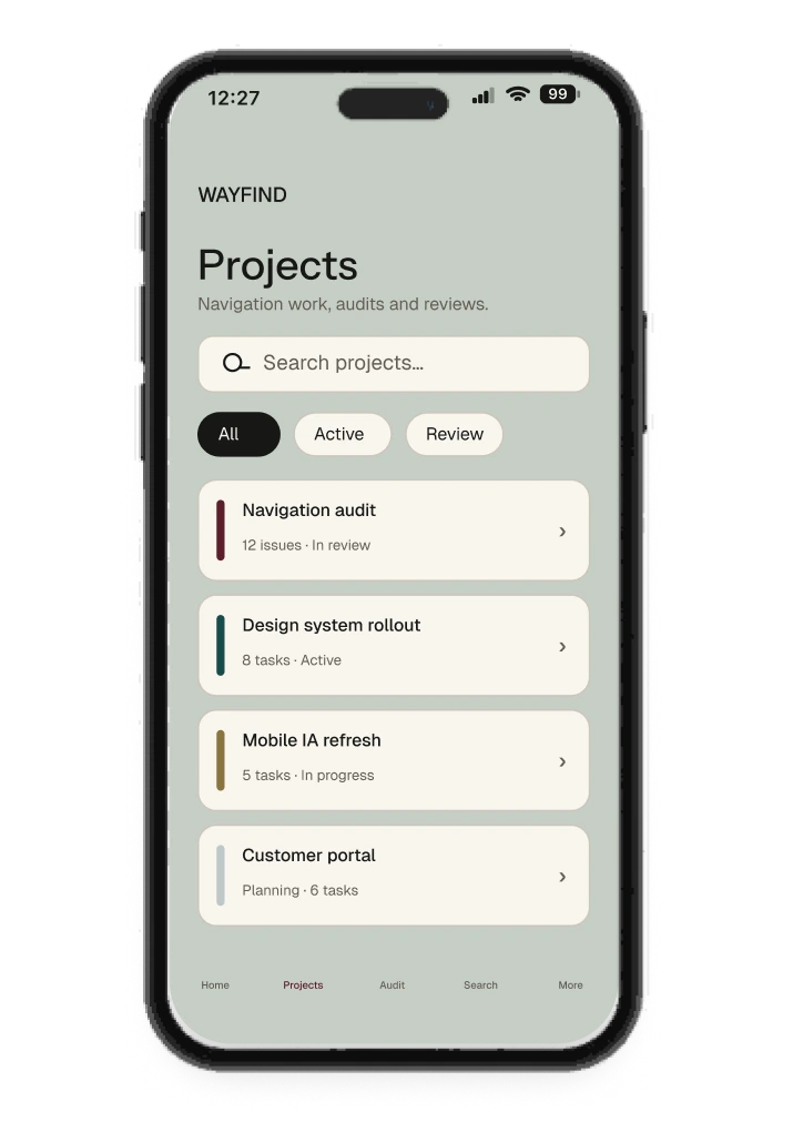
WAYFIND tests MESH in realistic review and handoff contexts.
Read the thinking
A system needs a real task
MESH is an independent UI system exploring consistent states, hierarchy and action patterns across mobile and desktop. I used WAYFIND, a product review and handoff workspace, to test the components in a realistic product context.
My role covered product and UI design, reusable components, responsive layouts and accessibility specifications. The question was whether one interaction language could carry a task across different moments and screen sizes.
One product. Four contexts
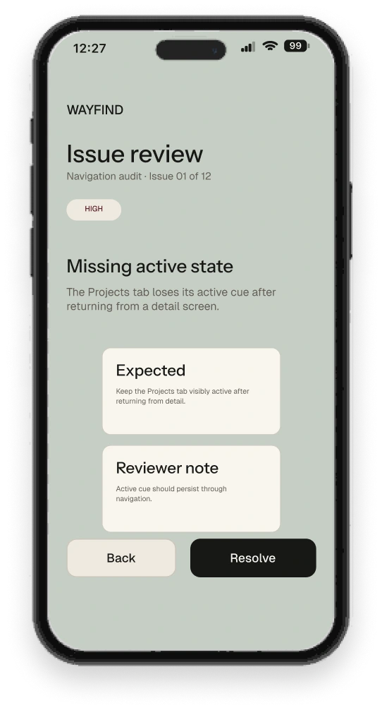
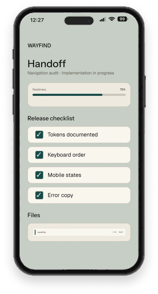
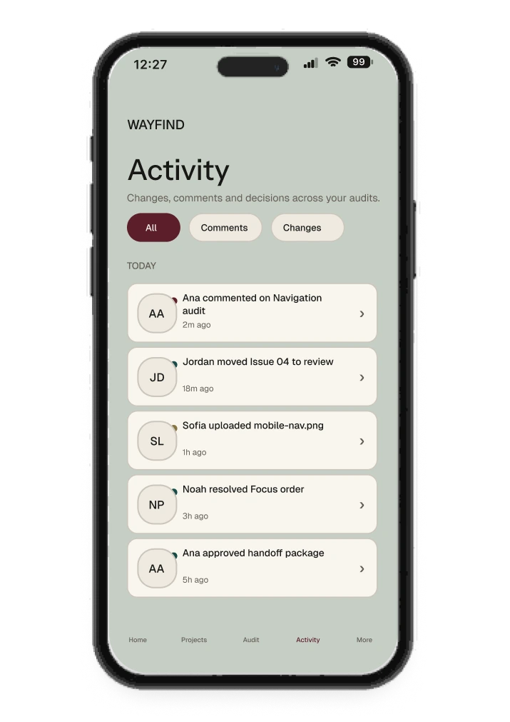
Projects, issue review, handoff and activity show how the same components and state patterns work together. The hierarchy stays recognisable while the task and density change.
Colour has a role
#171816
Foundation
#EEE9DF
Surface
#174B4A
Action & focus
#5B1F2A
Destructive
#8A7440
Secondary accent
#A65332
Warning
#BFC8C6
Quiet contrast
Clear at
every scale.
Details that
stay legible.
Read the thinking
Colour and type stay restrained
Neutrals carry the product. Material colours are reserved for active states, review, threshold and progress. The identity comes from proportions, seams and state placement.
Instrument Sans is used for display, headings and large numeric information. Geist supports UI text, reading and labels.
| Material colour | Role |
|---|---|
| Obsidian | Primary text and primary action |
| Vellum | Canvas and quiet grouping |
| Petrol | Active, focus and stable states |
| Oxblood | Review, destructive actions and errors |
| Brass | Threshold and progress |
| Oxide | Warning and emphasis |
| Fog | Quiet data and neutral states |
Stable action. Changing feedback
The action stays in place while feedback changes around it.

01 / DefaultReady for the next action.

02 / HoverA subtle change signals the pointer.

03 / FocusA visible rail locates keyboard focus.

04 / LoadingProgress stays inside the same dock.

05 / DestructiveConsequence changes the colour and label.

06 / DisabledAn unavailable action stays in place.
Read the thinking
Keep the action dock in the same place
Default, focus, loading and destructive states share one geometry. Feedback changes through labels, colour and a focus rail; the next action does not move when its state changes.
Six states. One steady structure
The action dock keeps the same geometry across default, hover, focus, loading, destructive and disabled states. State changes communicate progress or consequence without shifting the layout.
In context, the dock attaches to the task boundary: changes remain local until the user publishes. The relationship between the secondary action and primary action stays predictable.
One component logic
The same surface, seam, focus and status language carries across core components.
Review the final navigation label before publishing.
Component families reproduced from the current MESH UI Kit in Figma: Button, Search Field, Toggle, Tabs, Card, Toast, Result State and Focus Ring.
Read the thinking
New layout. Same task
Desktop shows the workspace; mobile narrows to issue review without changing hierarchy or action priority.
-
01
Issue first
Severity and the problem stay together.
-
02
Decision criteria
Expected state and reviewer note stay attached.
-
03
Actions within reach
Back and Resolve remain visible at the end of the task.
- What stays
- The issue, its severity and the action hierarchy.
- What changes
- Navigation and density adapt to the screen.
- The trade-off
- Mobile focuses on the review task, with less workspace context visible at once.
Read the thinking
The same product at a different scale
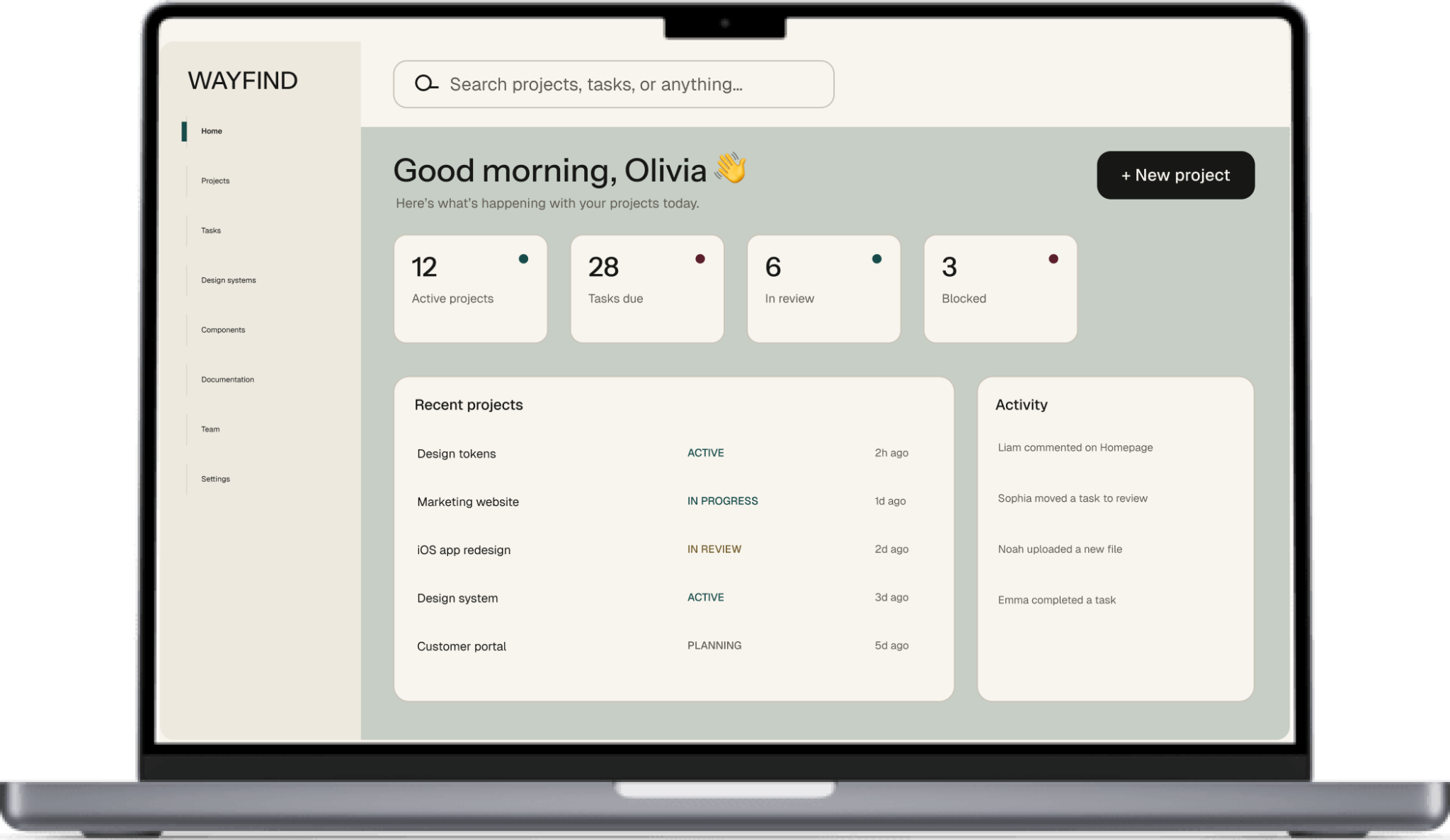
Navigation, project metrics, recent work and activity sit on one continuous workspace surface. The desktop view keeps context broad without changing the system language.
WAYFIND is a sample product created to demonstrate MESH, not an existing product or measured customer deployment.
The layout changes. The task does not
The review task keeps its information hierarchy, state treatment and action dock from desktop to mobile. Navigation condenses as space becomes smaller; review context and primary actions keep their priority.
From review to handoff
-
01 / AUDIT
Find the issue
Keep hierarchy and severity visible.
-
02 / RESOLVE
Make the decision
Use explicit state and a clear commitment action.
-
03 / HANDOFF
Carry context forward
Files, checks and activity stay attached to the work.
Independent design specifications; no live adoption or coded accessibility audit is claimed.
Read the thinking
From issue review to handoff
Audit, issue review and handoff use the same status language, action hierarchy and responsive rules. Files, checks and activity remain part of the same system instead of becoming a separate handoff layer.
The handoff includes tokens and variables, reusable components, contrast specifications of at least 5.64:1, keyboard order guidance, visible focus and 44 px targets. These are design specifications, not results from a coded accessibility audit.
MESH is an independent system exploration. No live product adoption or user testing outcome is claimed.
- ≥ 5.64:1, Contrast specification
- 44 px, Target size specification
- 1, Shared interaction language